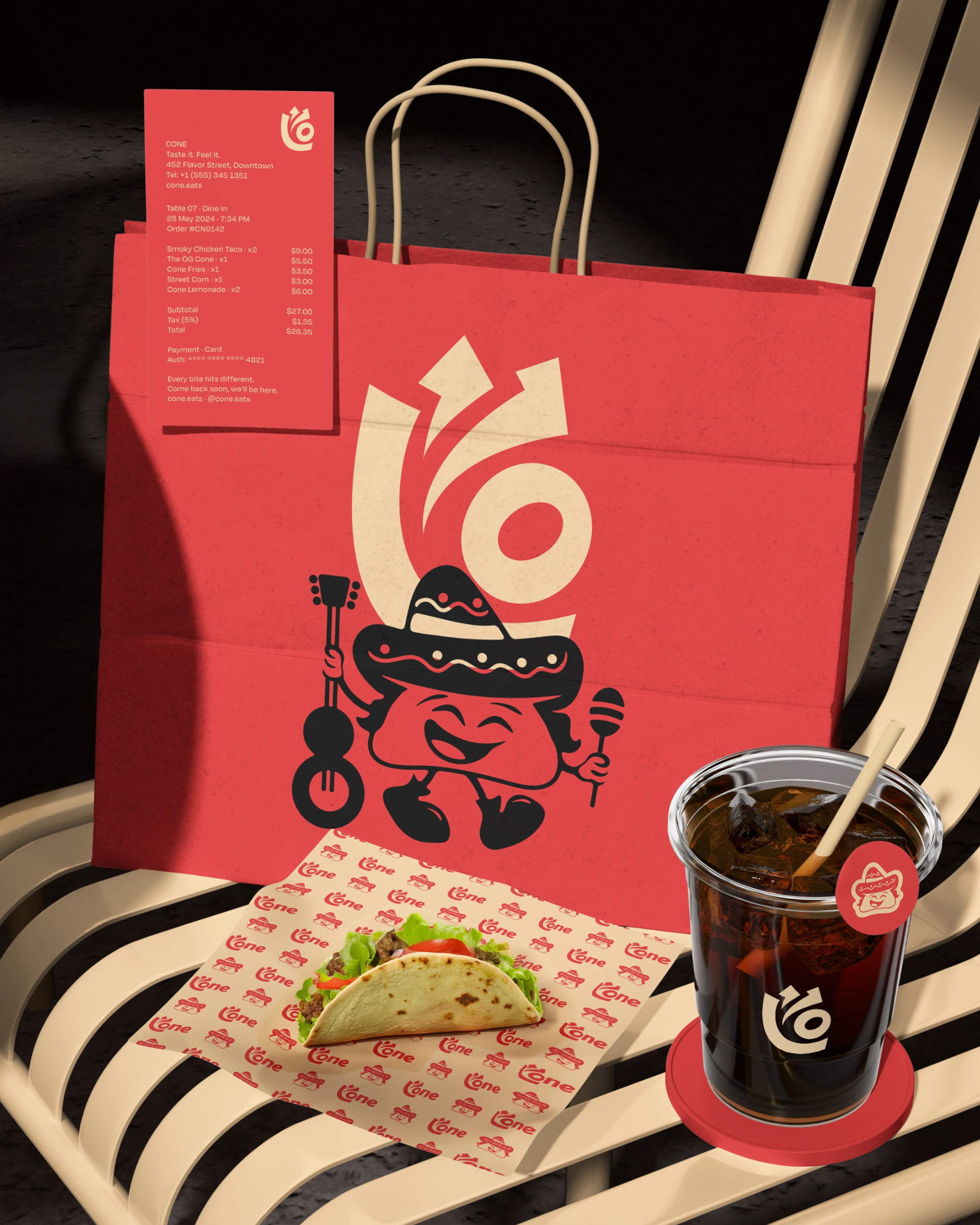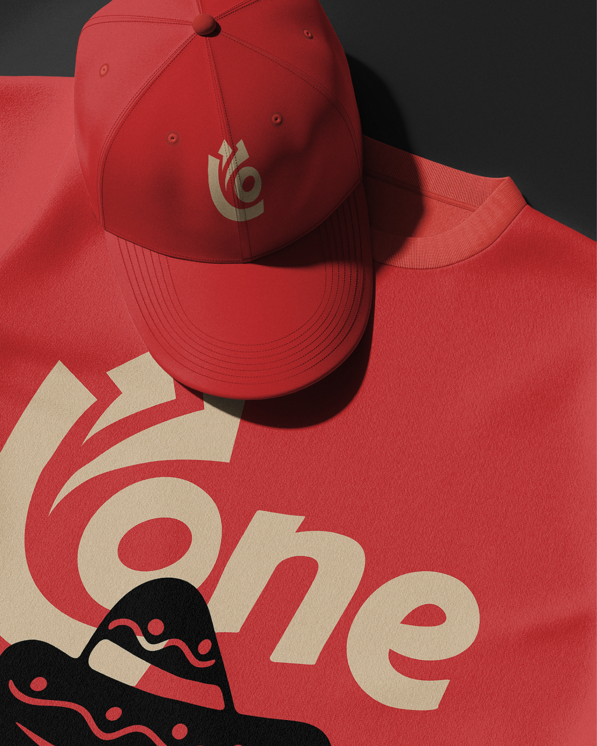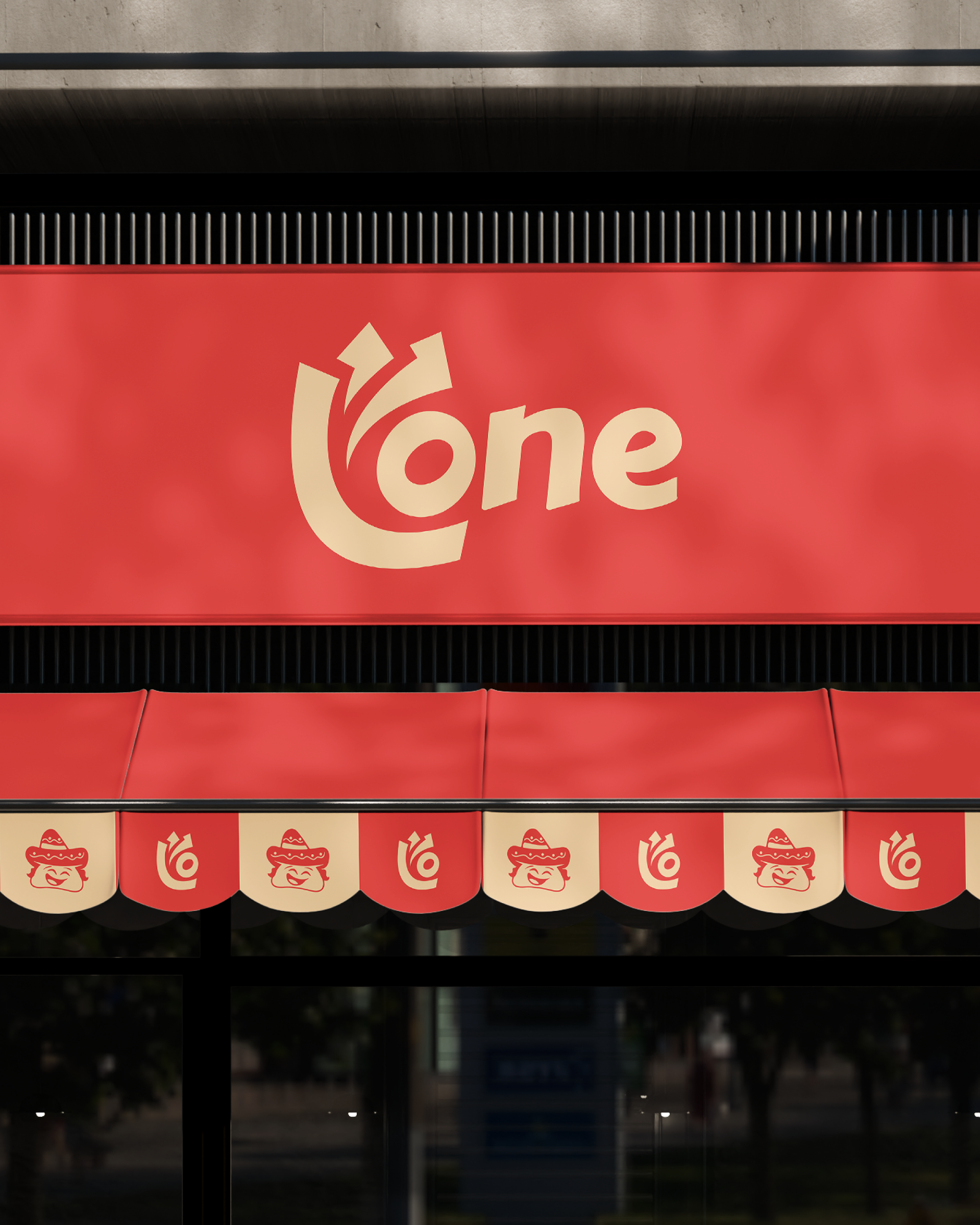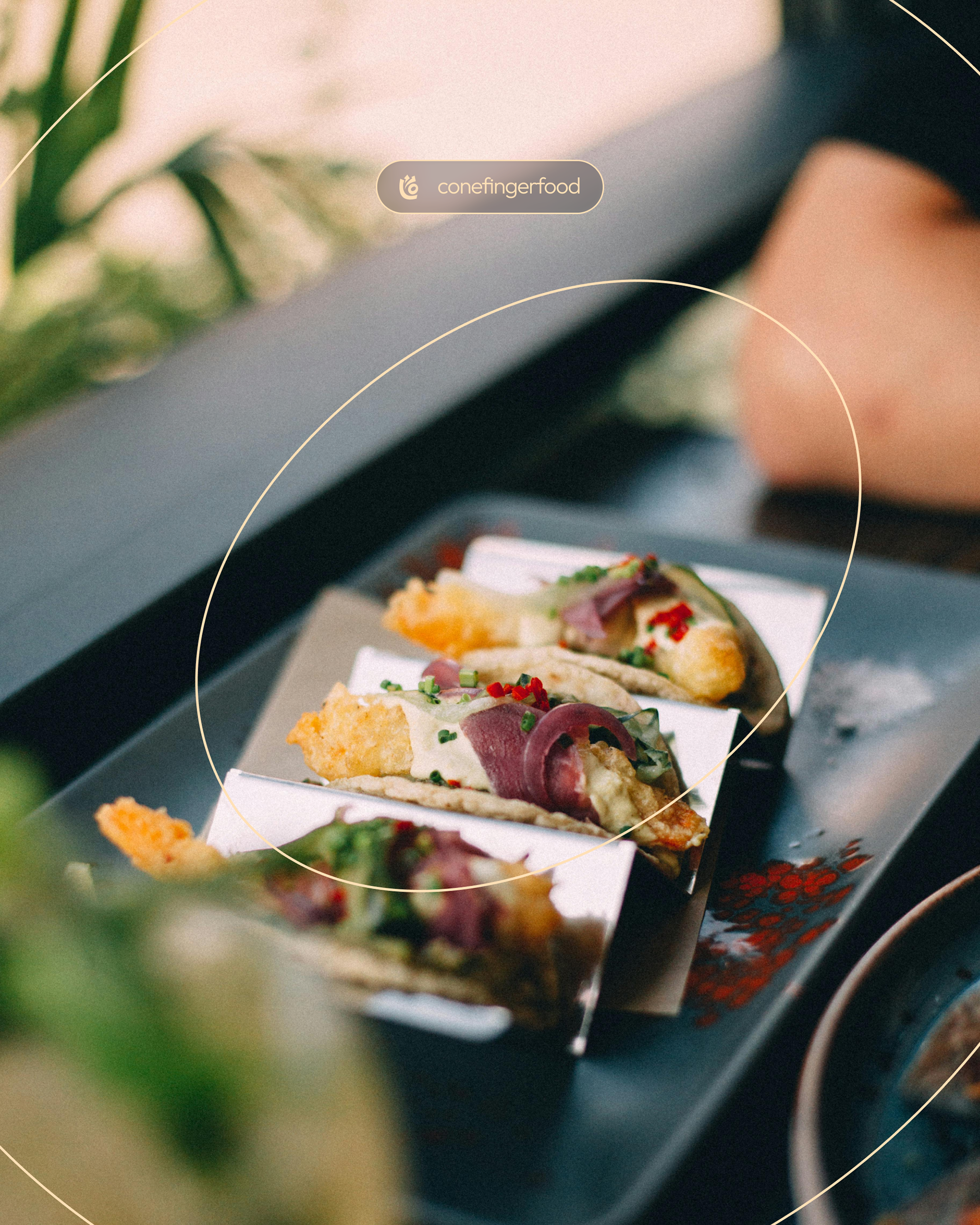
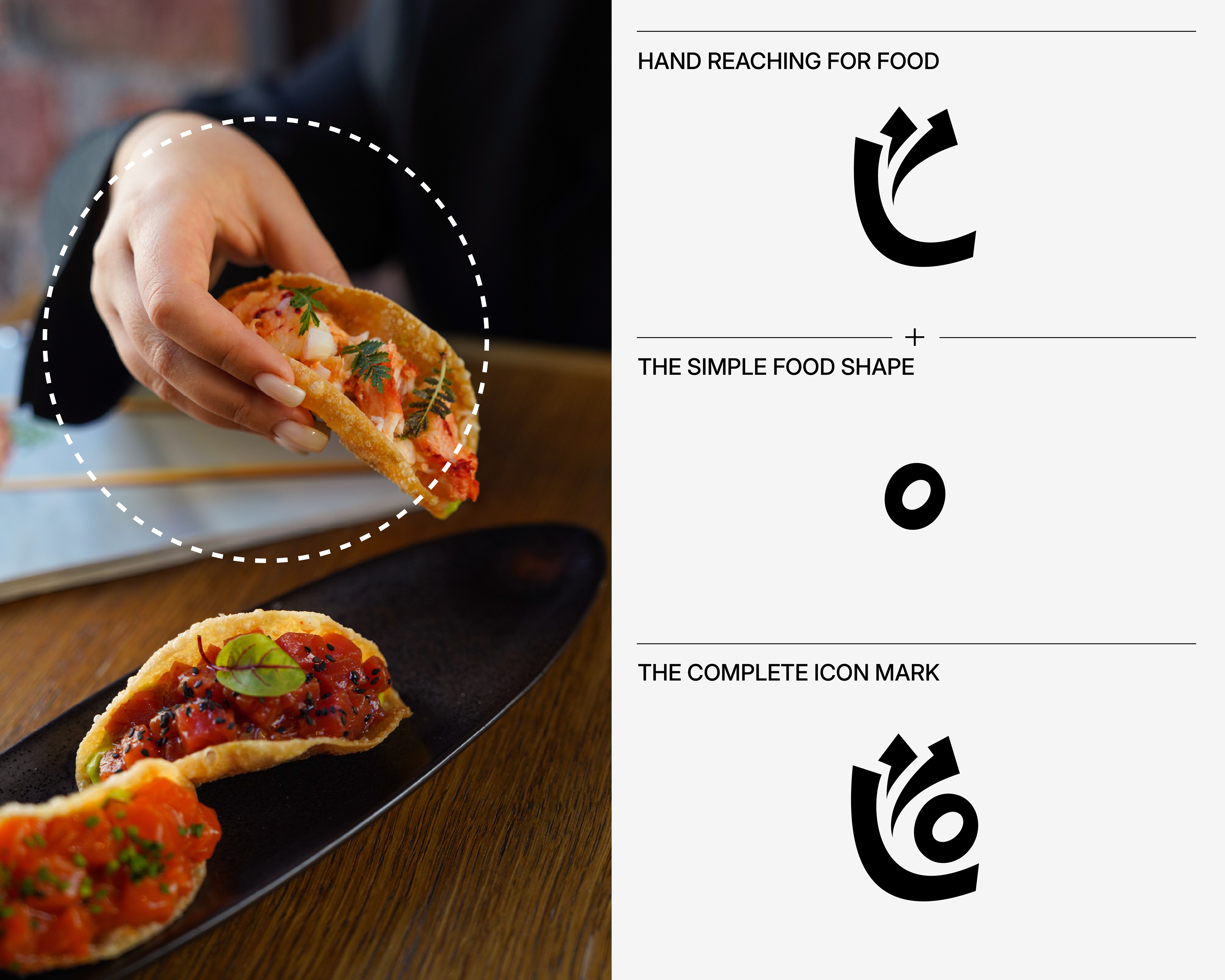
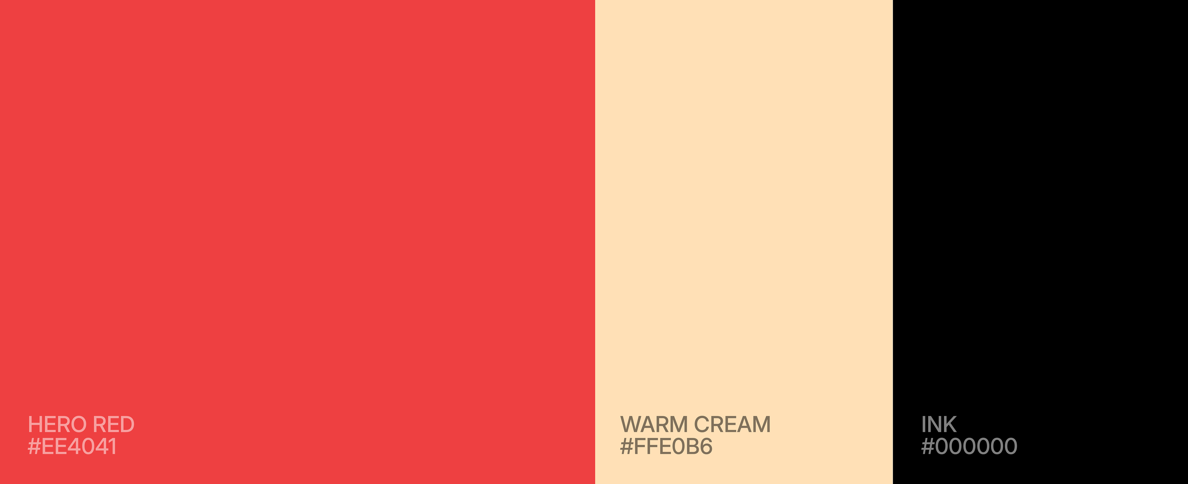
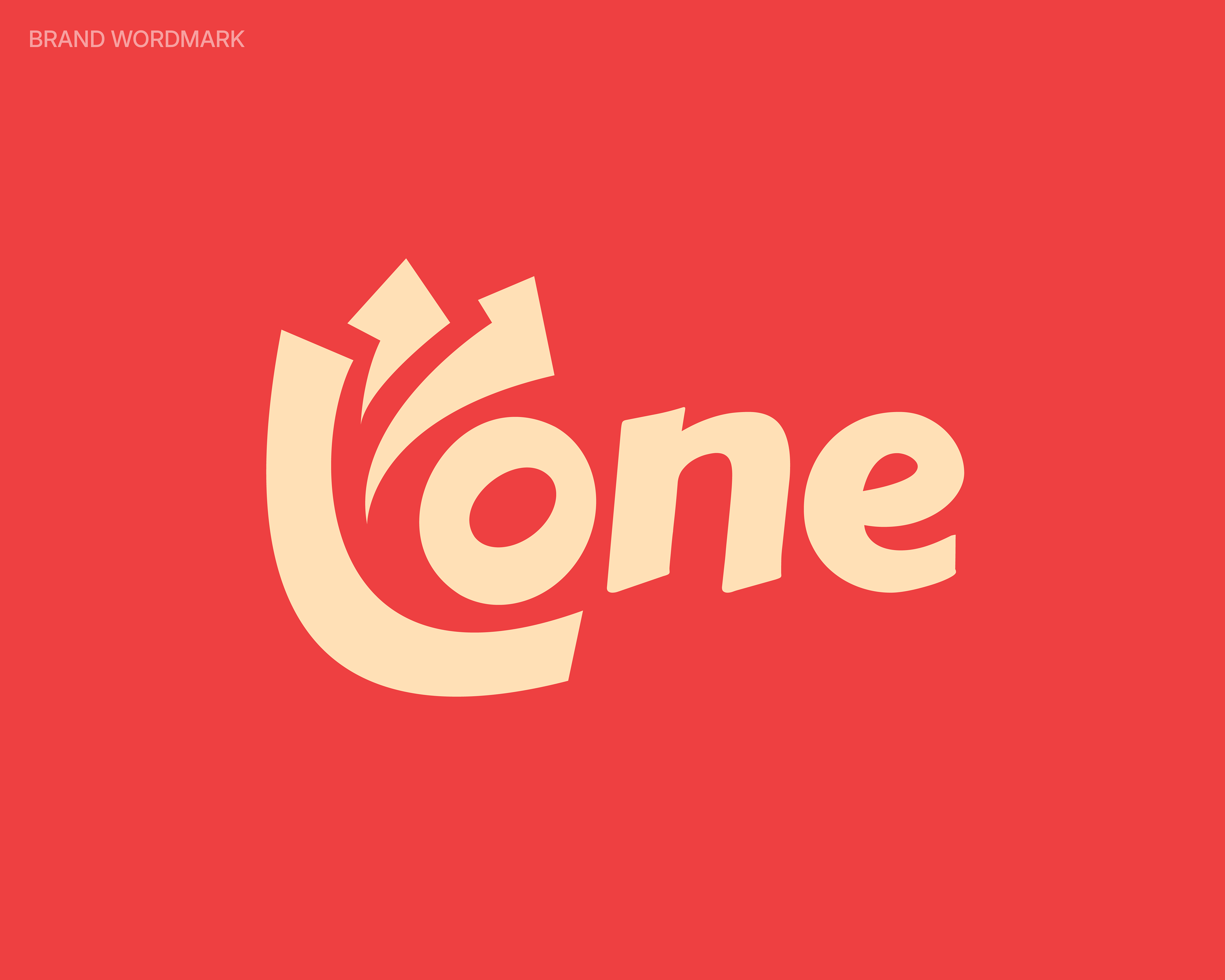
Started with the mark, I wanted something that didn't just sit on a page but felt like it was mid-motion, so I pulled from the most honest moment in eating, the instinct to reach for food, and that single gesture became the icon. The palette had to match that same confidence: Hero Red leads loud and hungry, Warm Cream pulls it back just enough to breathe, and Spice, Earth, and Ink bring in the depth and richness of real ingredients sitting on a street counter. Together they don't just look good, they feel like food
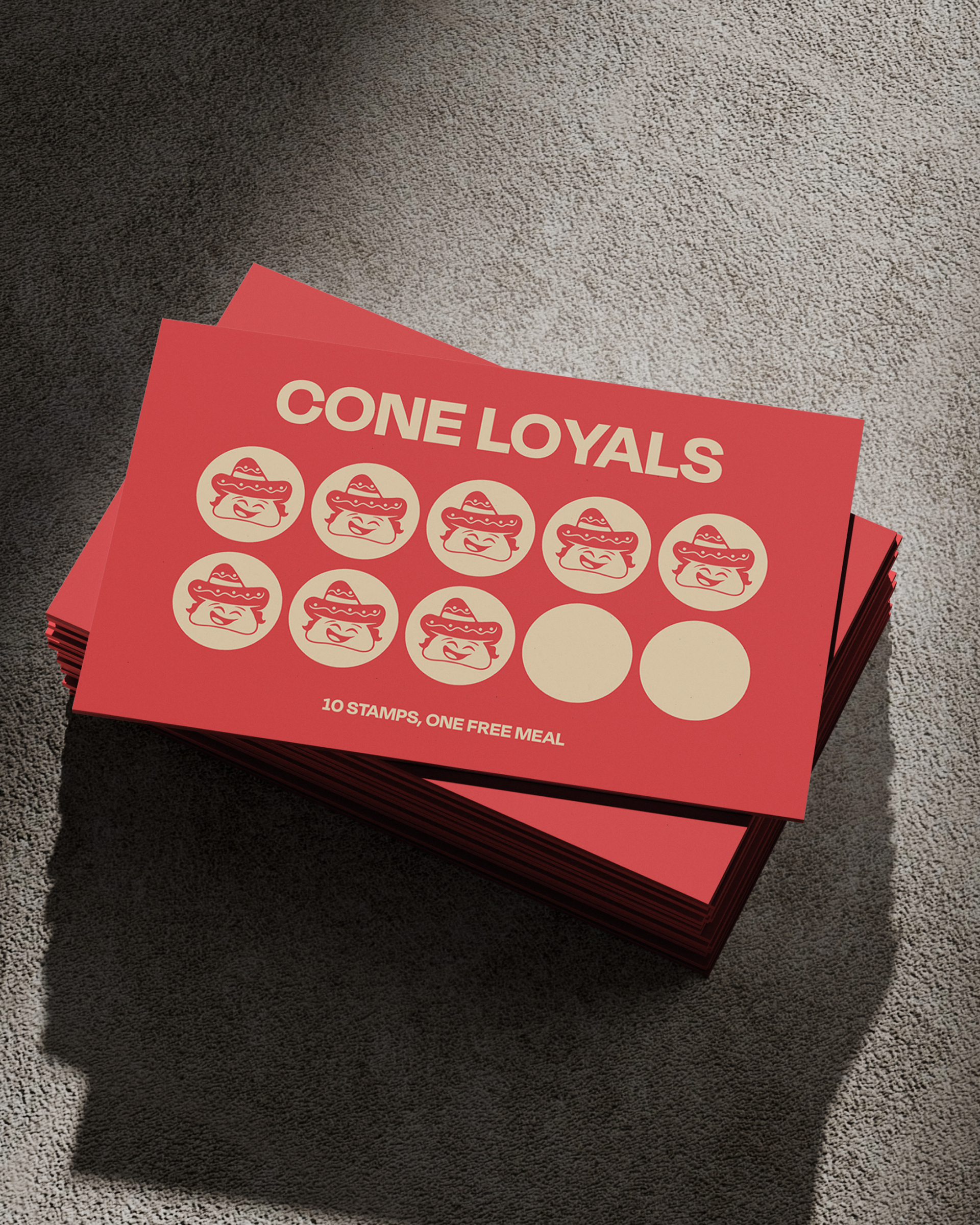
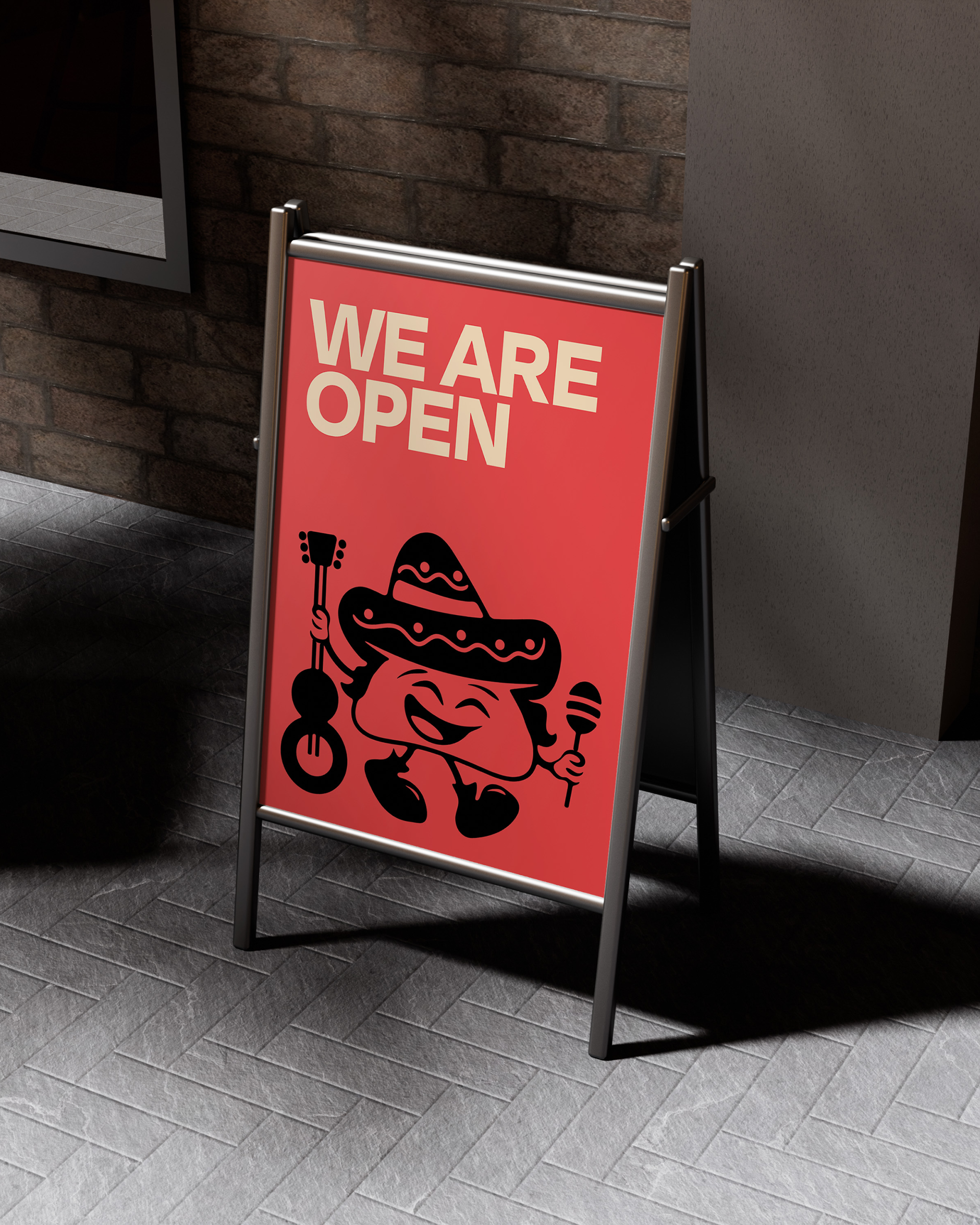
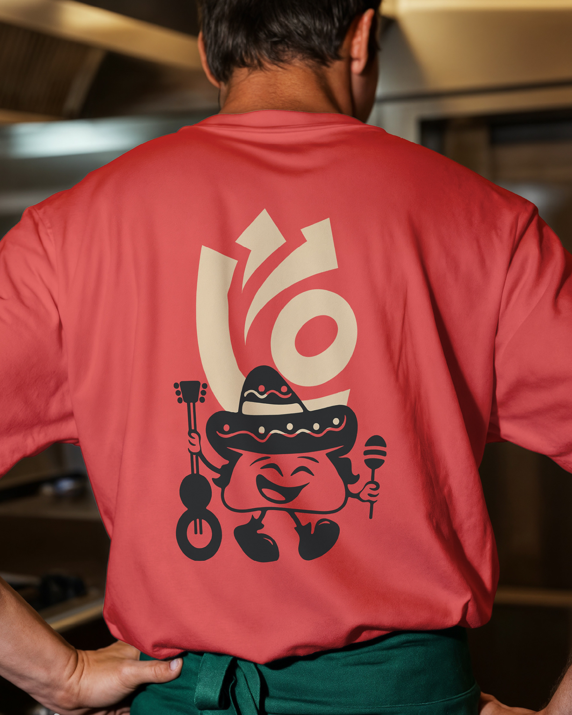
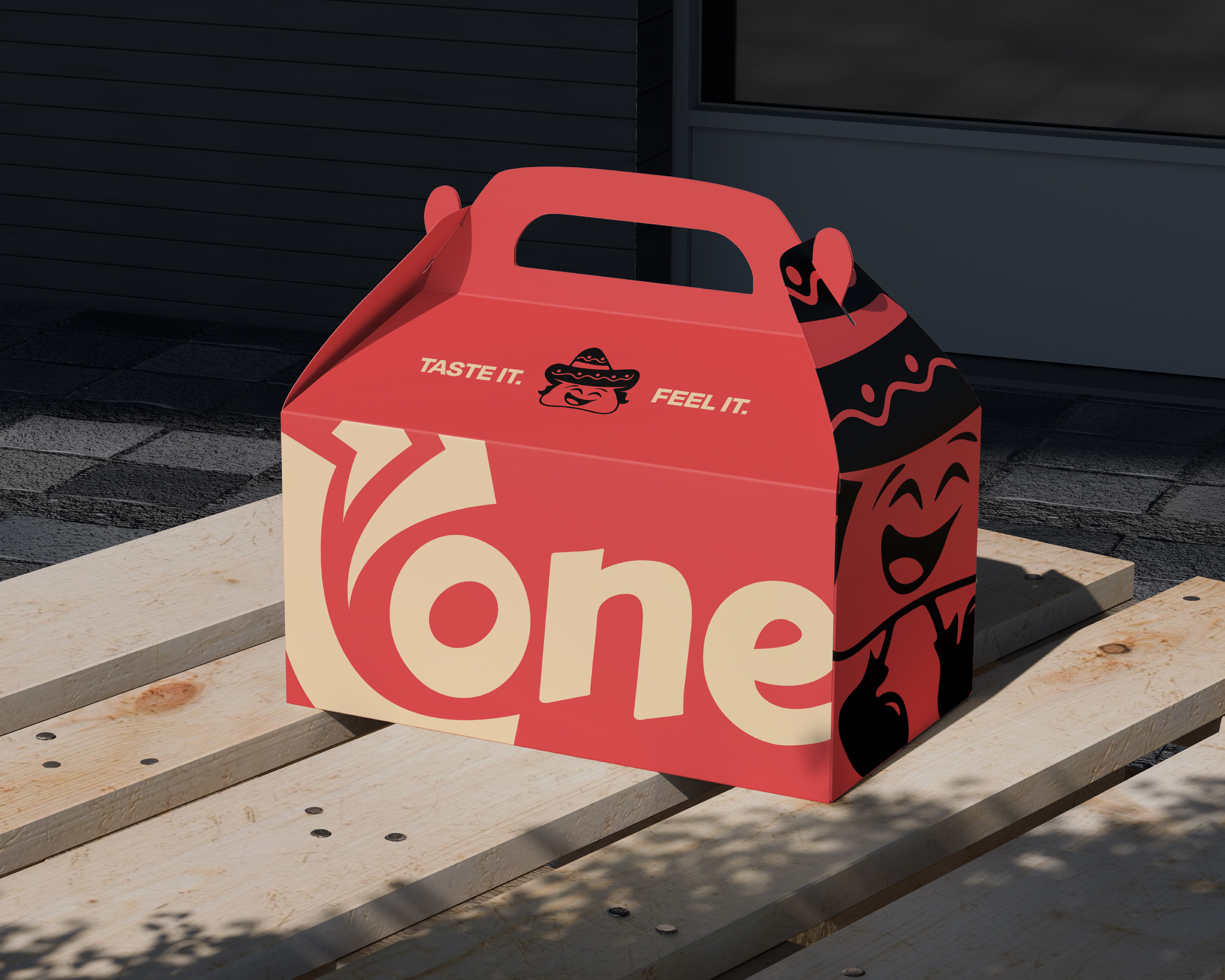
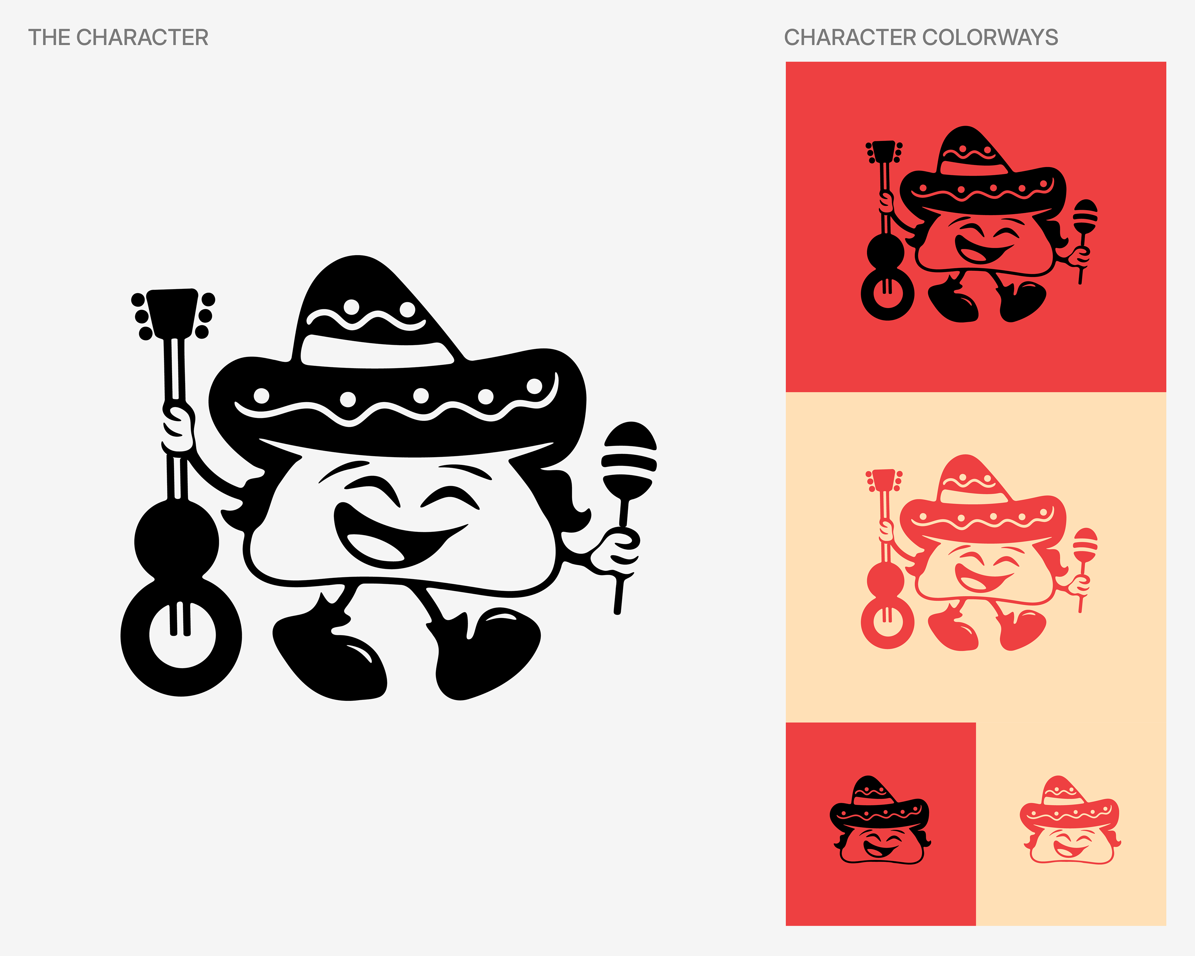
Once the visual foundation was there, the brand needed a soul. That's where Mr. Cone came in a guitar-strumming, sombrero-wearing character who carries the brand's energy into spaces a wordmark alone never could. He doesn't take himself too seriously, and that's exactly the point. He makes the brand human, joyful, and impossible to forget.
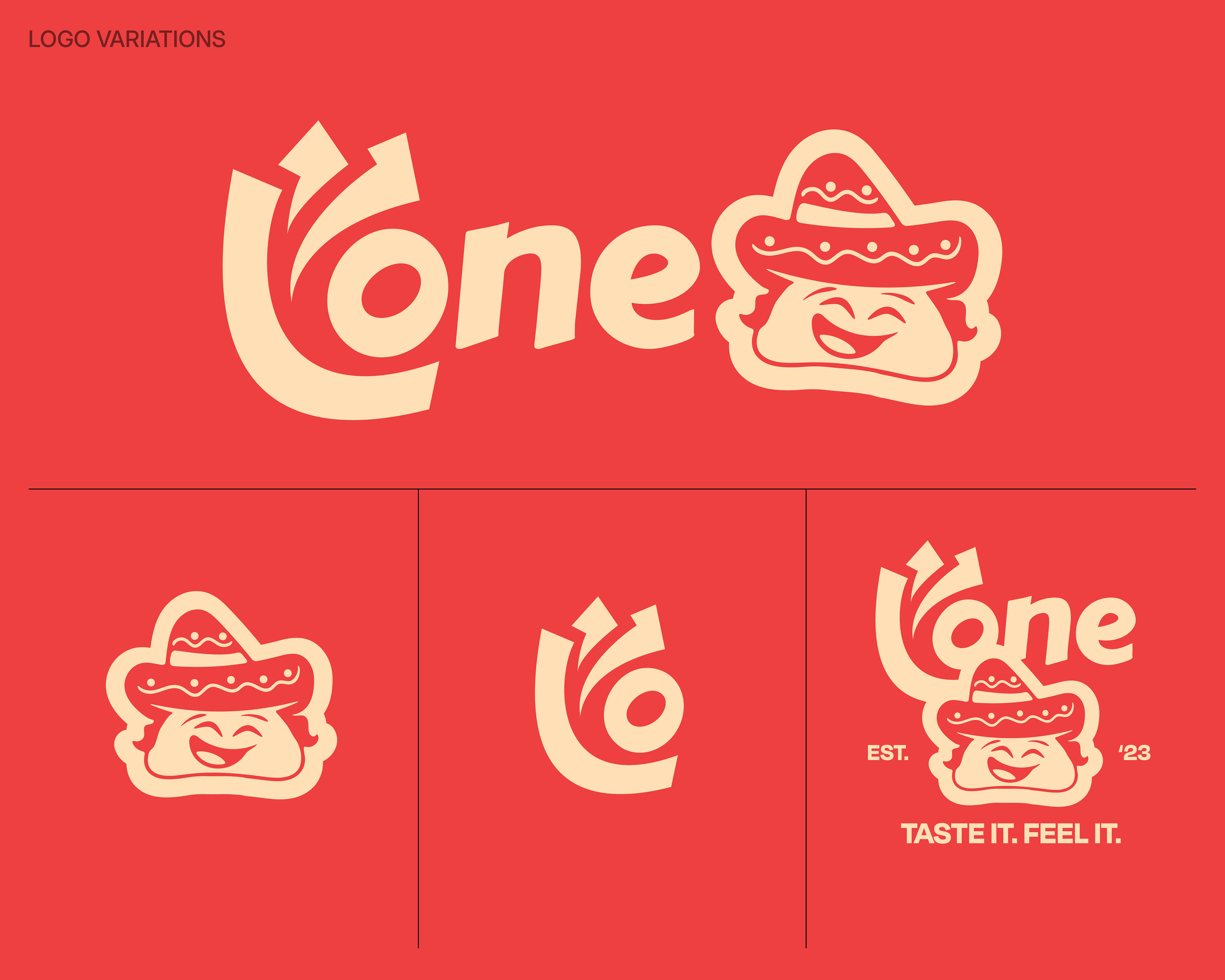
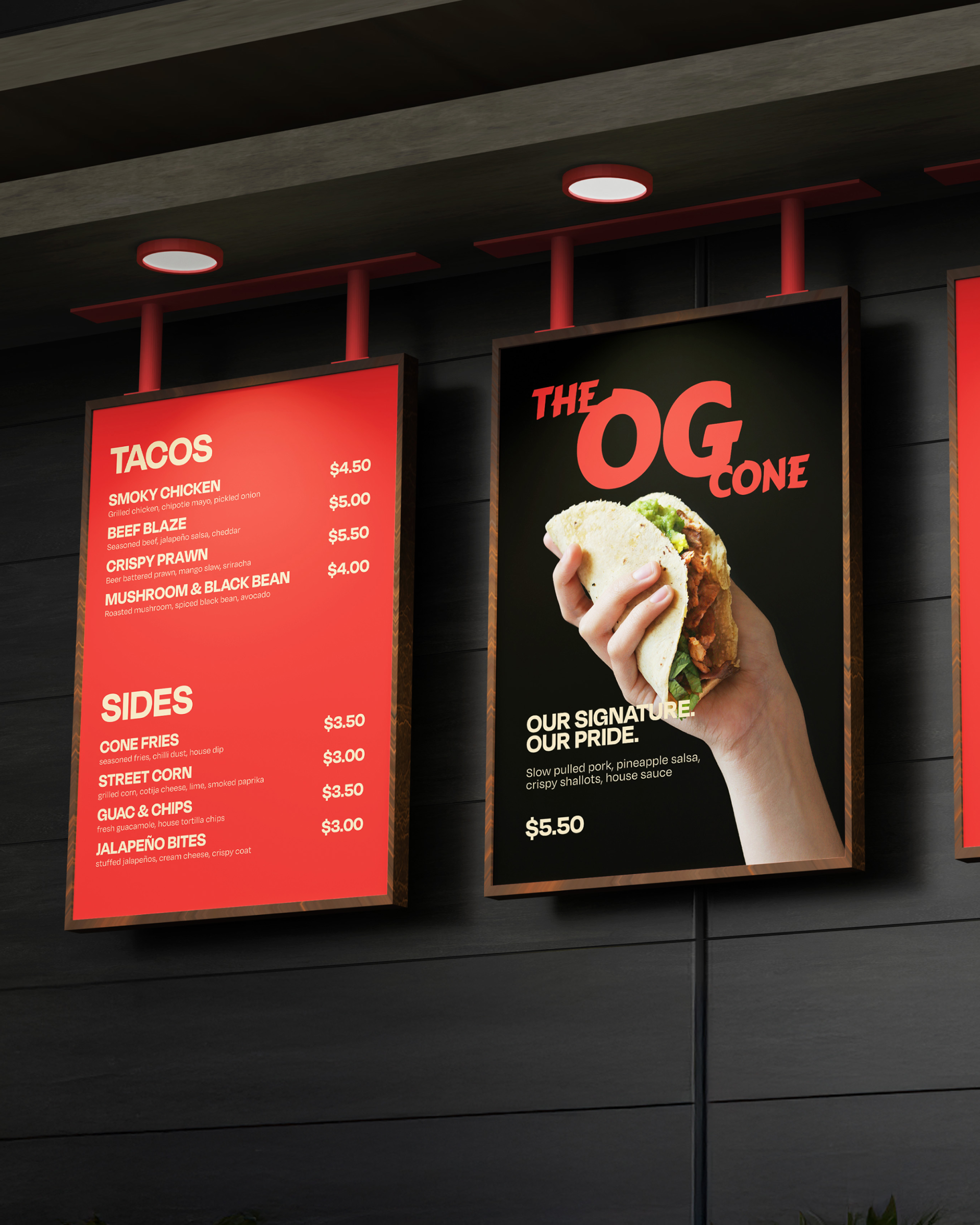
The full suite brought it all together, every lockup, every version, one system that knows how to show up anywhere without losing who it is.
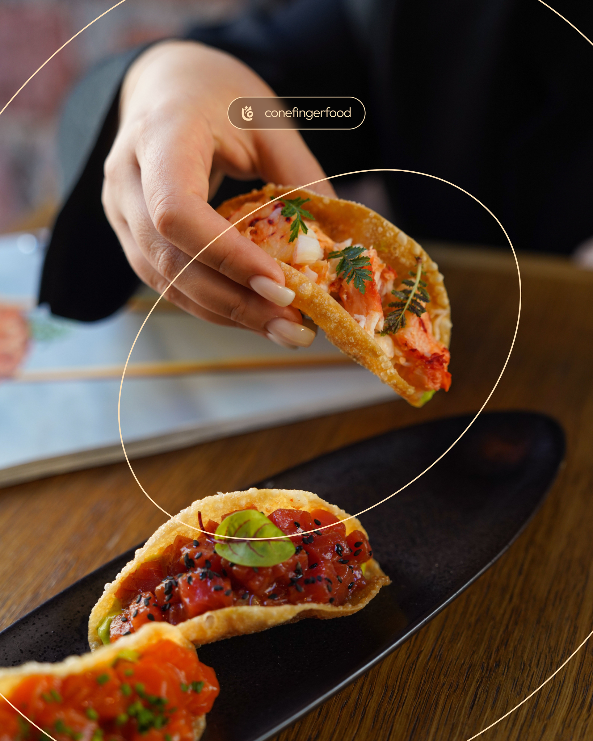
Cone is bold, warm, and built for the good times. It doesn't just sell tacos. It sells a feeling.